Careers Victoria
Modernising a critical public-facing platform clear content and a better user experience.
Design challenge
Users told us that they often felt lost on Careers Victoria. The content was outdated, and it was hard to find relevant roles, eligibility information or old applications. The site was also hard to use, not fully accessible, and hard for teams to maintain behind the scenes.
The design challenge was to:
make it easier to search for jobs so people can quickly find roles that match their skills and interests.
make the site accessible for everyone, including people using screen readers or assistive technology.
encourage more people to create accounts so they can save jobs, get alerts and use the site’s full features.
move the site onto a better tech platform so it’s faster, more secure and easier to update.
We also needed better ways to support departments trying to fill urgent or hard-to-recruit roles. This meant giving them a simple way to promote job campaigns on the homepage and improving the internal process so requests could be handled quickly and consistently.
Long story short…
We wanted to turn a confusing, outdated site into a simple, supportive job-seeker experience and help recruiters reach the right people at the right time.
Connecting job seekers with public sector employers to strengthen services for the Victorian community.
Careers Victoria is the Victorian Government’s main platform for helping people find jobs, understand the public sector and build meaningful career pathways.
Careers Victoria gets over 16 million views a year. It’s similar to platforms like Seek, where people can search for jobs using a mix of key words and filters, set up job alerts and save searches.
-
When I joined the Victorian Public Sector Commission, the Careers Victoria site was full of duplicated content, outdated guidance and pages written in language that didn’t reflect how real people search for or think about jobs.
Job seekers told us they struggled with:
finding relevant roles
understanding eligibility or application steps
navigating long, dense text
inconsistent job listing formats
forms and content that weren’t fully accessible
receiving too many support emails for questions that should have been easy to answer themselves.
Our goal was to rebuild the platform so it could support people in these moments. I led the user experience and content team responsible for shaping this work.
-
Approach
We rebuilt the experience in clear, collaborative stages:
1. Understand the job-seeker journey
We mapped the full journey from searching to applying, and identified where people felt confused or stuck.
2. Re-designed the site structure
We redesigned navigation, page templates and search filters and labels to reflect real user behaviour.
3. Rewrote all key content
We translated complex processes into clear, direct guidance anyone could understand and removed out of date information.
4. Introduce automation and self-service tools
We improved help content, onboarding and automated emails to reduce help-desk load based on data and research.
5. Improve accessibility
We ensured content met WCAG 2.1 AA standards and improved structure for screen readers.
6. Support departments with recruitment challenges
We added homepage banners and a formal campaign request process to improve visibility for urgent roles.
-
My role combined product ownership, hands-on content strategy, research and team management.
I worked closely with designers, developers, policy owners, authors and recruitment teams across multiple government departments.
Product Leadership
Set the vision and roadmap as Product Owner.
Created agile workflows, rituals and JIRA structures to keep the project aligned.
Partnered with vendors and design teams to ensure delivery matched user needs.
Content Strategy and Design
Led the content strategy, information architecture and editorial standards for all pages.
Rewrote job-seeker guidance, application steps and support content in plain language.
Improved navigation labels, job listing templates and page structures for scannability.
Designed automated emails, onboarding flows and Freshdesk help-desk responses to reduce repetitive support queries.
Promoting Job Opportunities
Introduced homepage campaign banners to highlight priority roles for departments in need.
Designed a standardised request form and publishing process so teams could easily submit campaigns and get them live quickly and consistently.
Research and Co-Design
Faciliated workshops and usability testing with job seekers, graduates and internal teams.
Used insights to refine navigation, messaging, tone and content patterns.
Team Leadership
Managed and mentored UX and content designers.
Built capability across authors and internal teams through content coaching and clear standards.
-
The redesign delivered meaningful improvements for both job seekers and internal teams.
For Job Seekers:
a clearer, simpler job-search experience
less confusion and better guidance at each step
more accessible content and navigation
shorter paths to find relevant roles.
For the Victorian Public Sector Commission:
a scalable, modern content and IA framework
stronger editorial governance and clearer standards for authors
reduced support-ticket volume through better self-help content
faster, easier publishing for job campaigns
a platform that can grow with new features and recruitment needs.

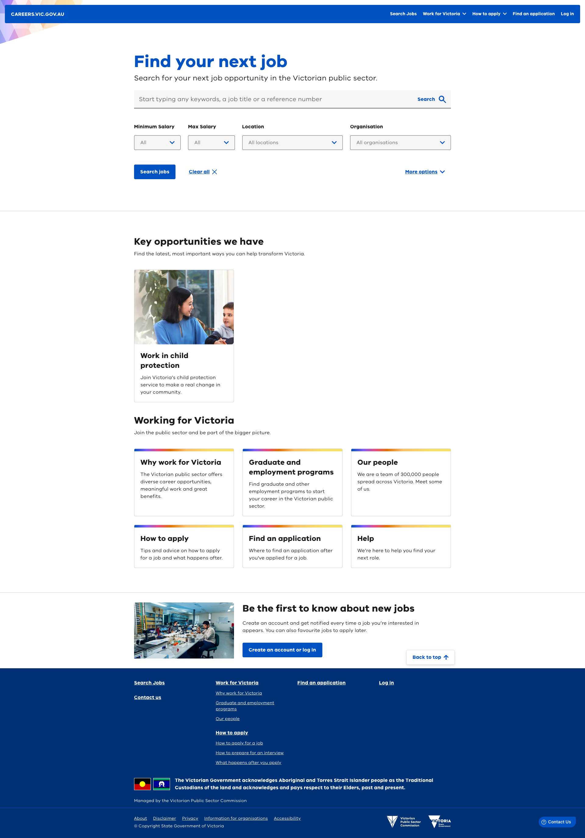
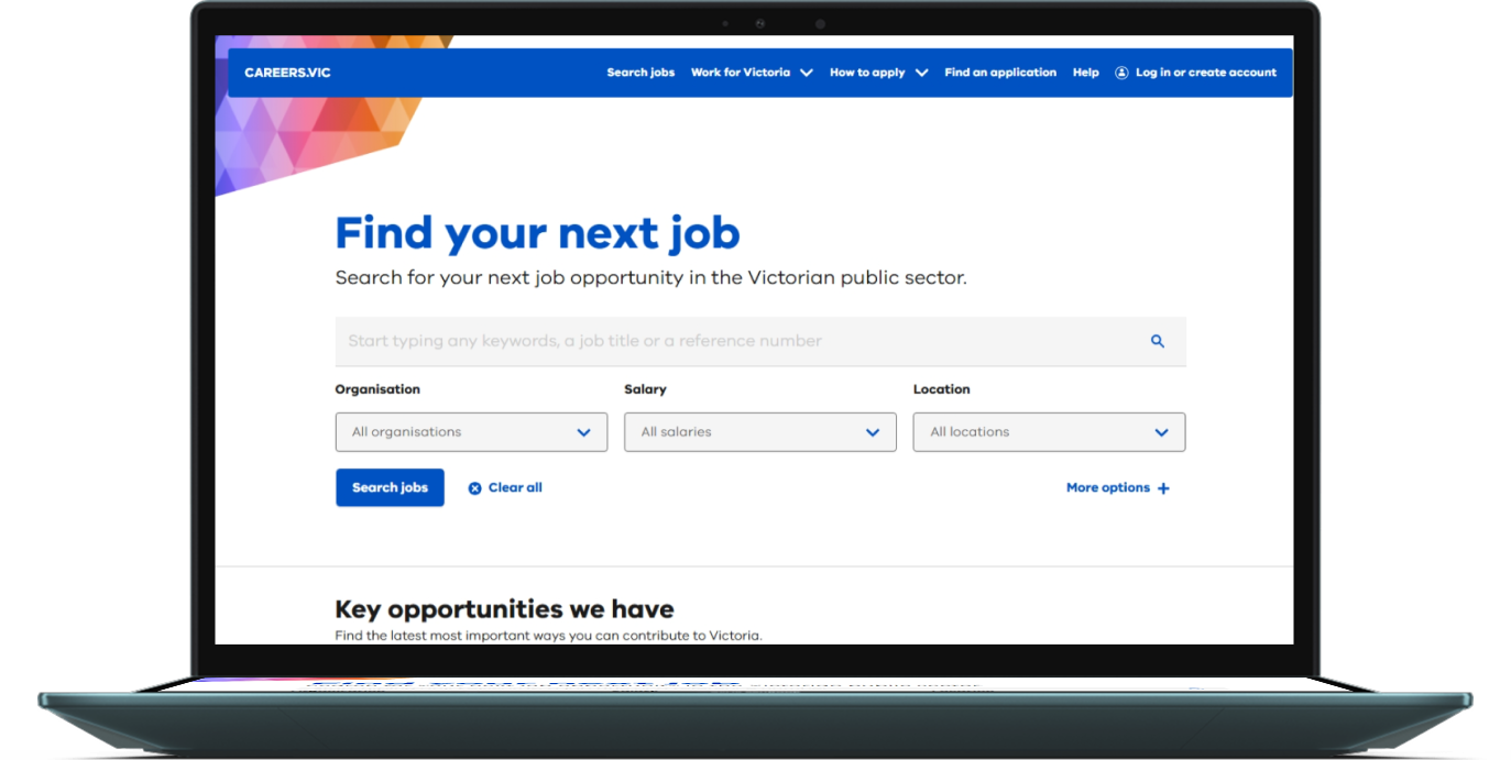
Home page design with room for campaign banner.
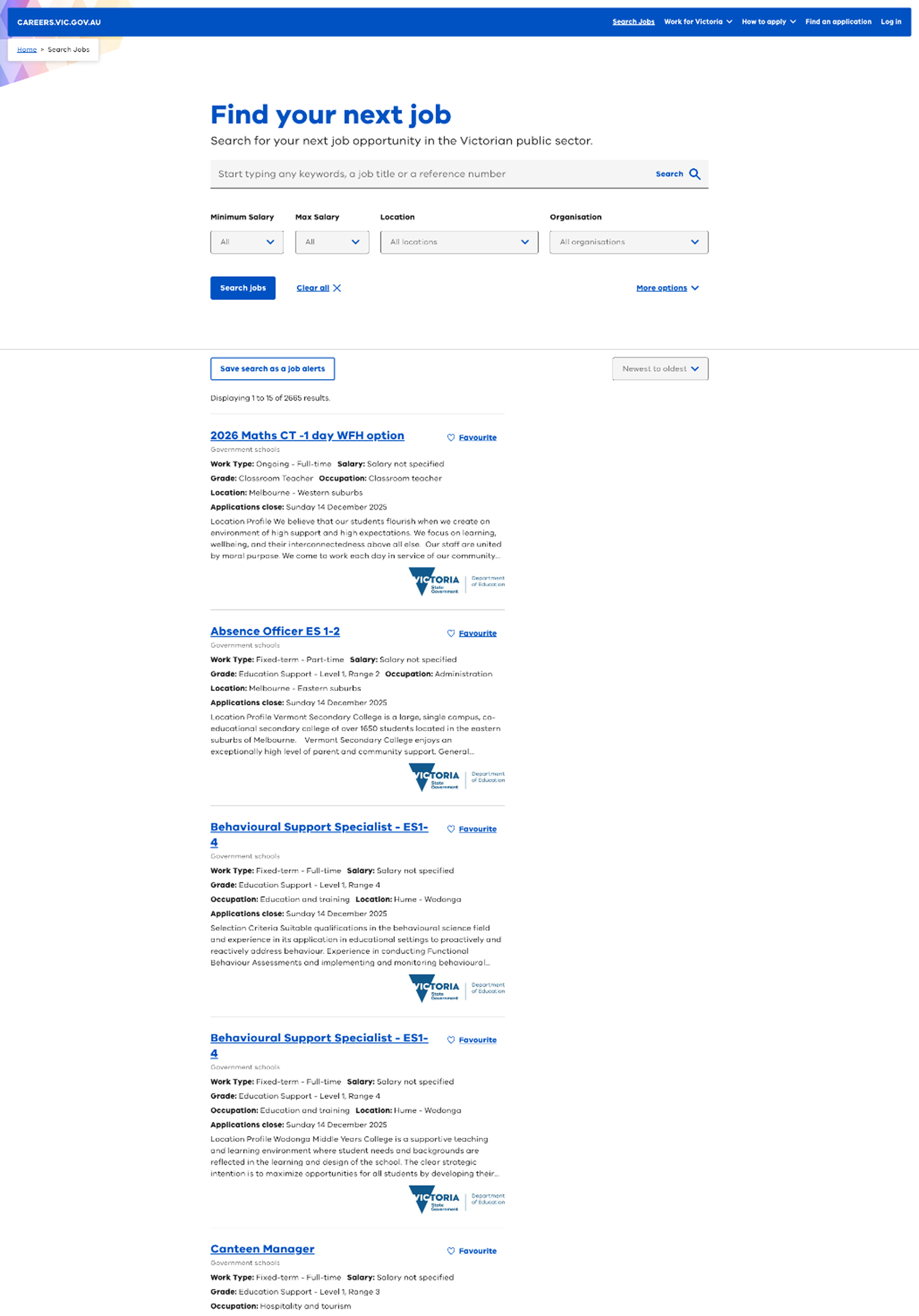
Better search page with more intuitiive filters and scanability.
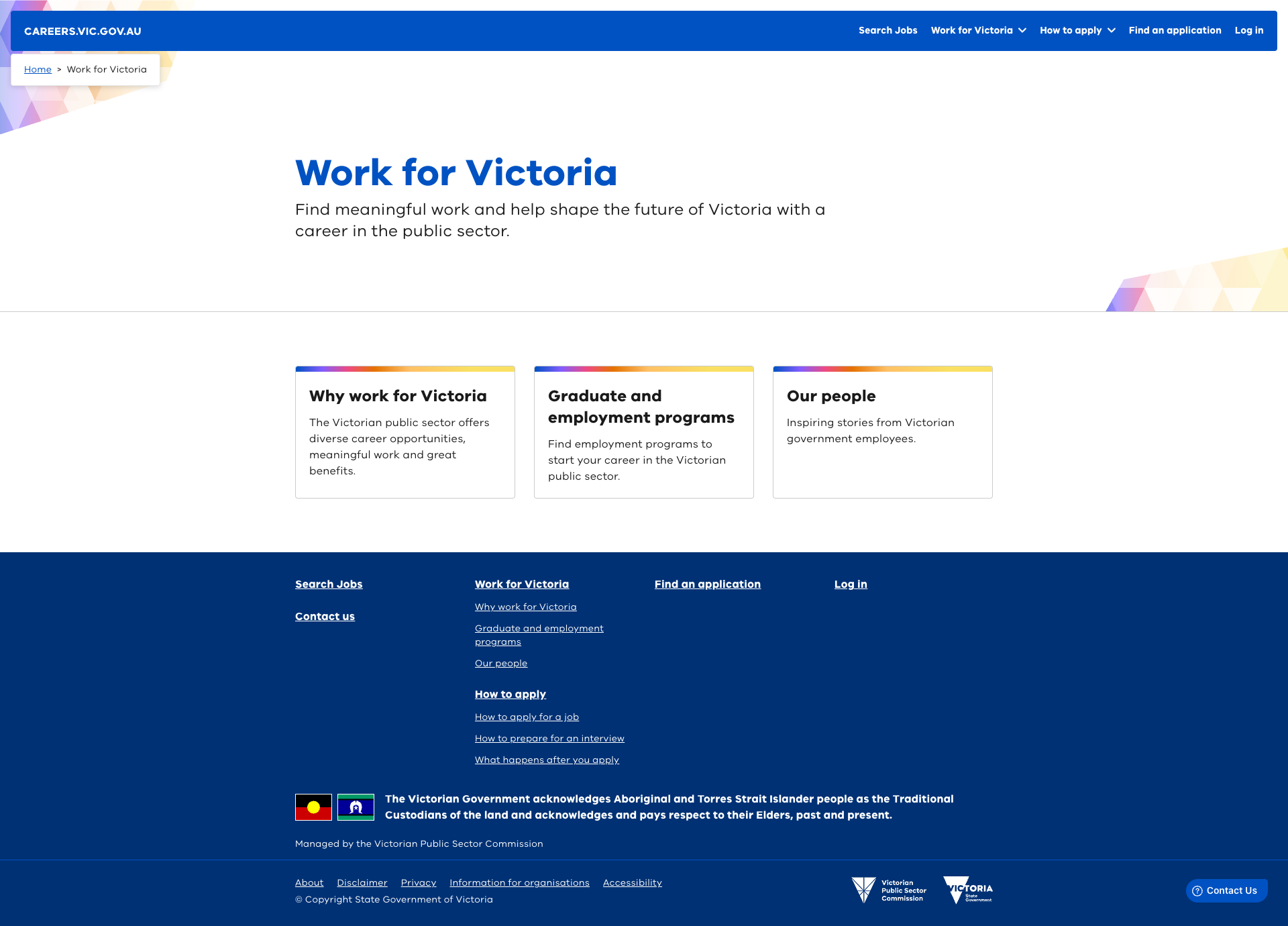
Updated content and intuitive groupings to improve experience for users.
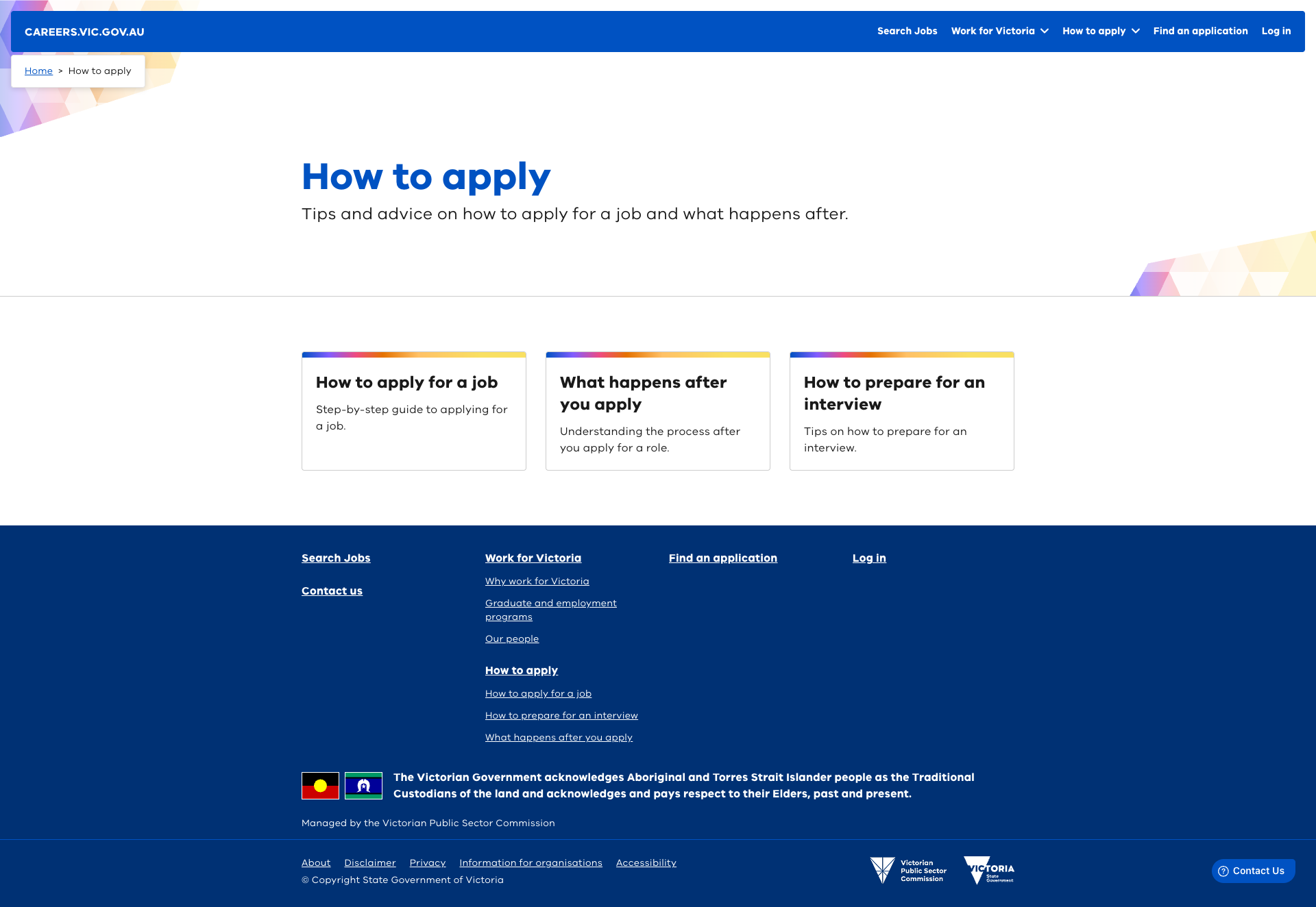
Practical advice and instructions on how to apply for a role, what happens after and how to prepare for an interview.
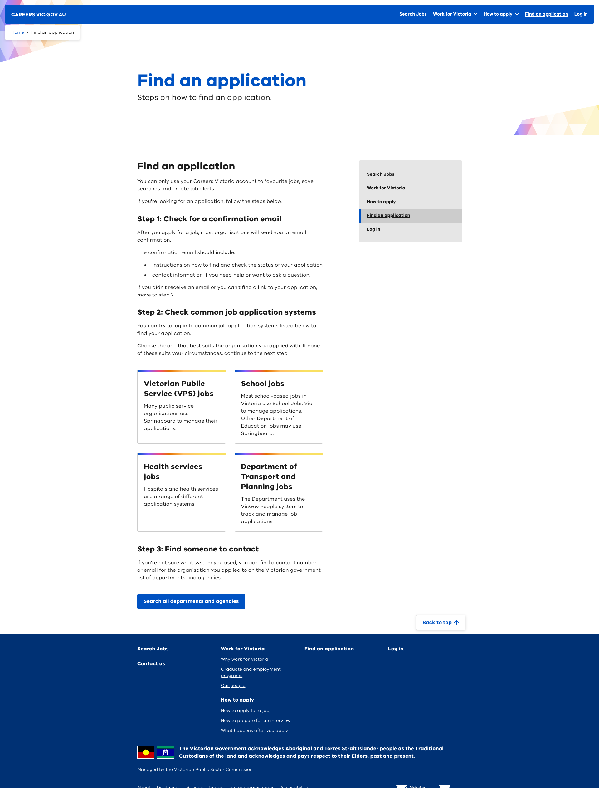
Clear content designed to assist users find applications due to a complex back-end environment.